down to earth
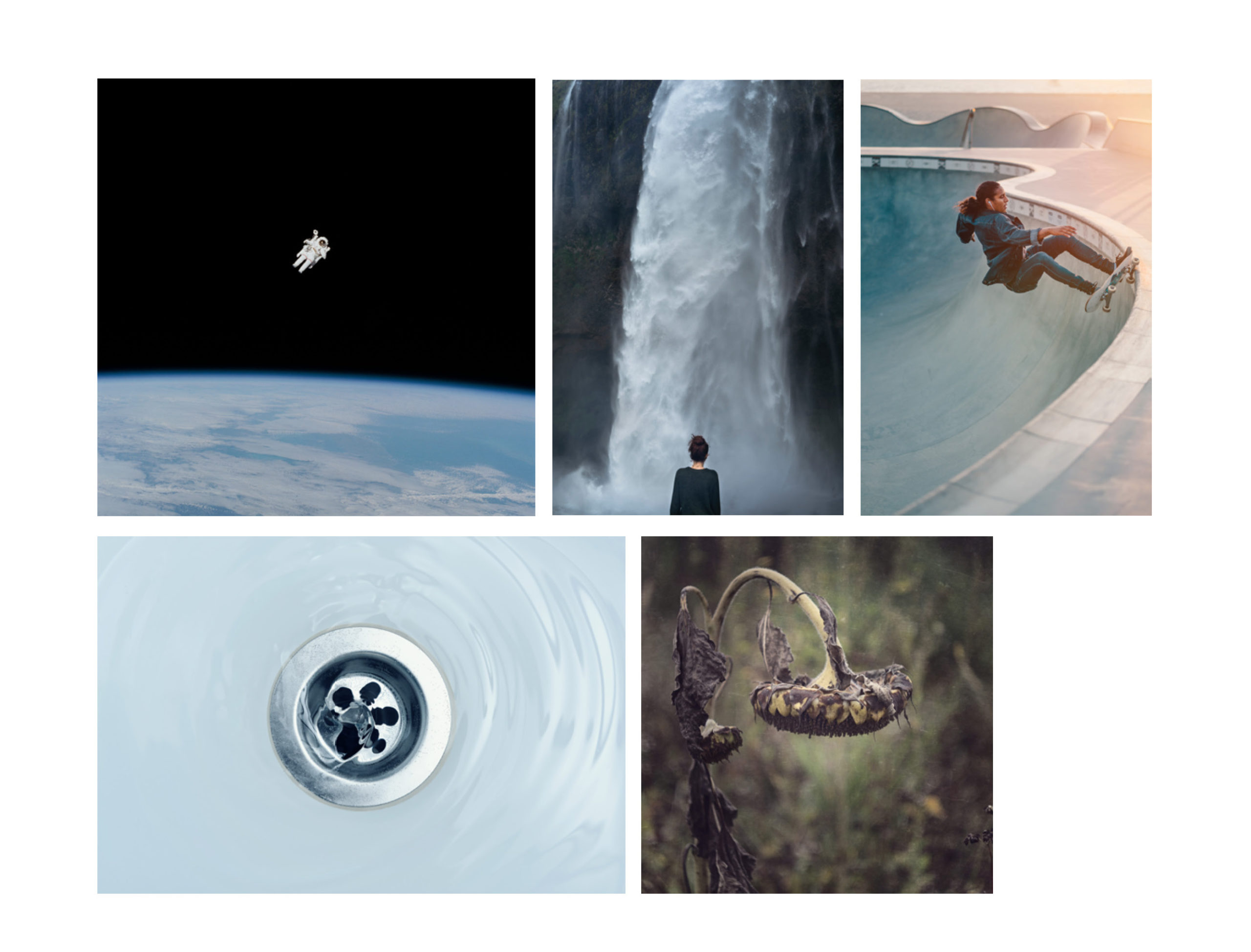
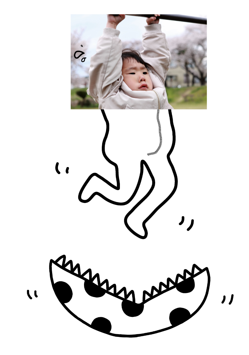
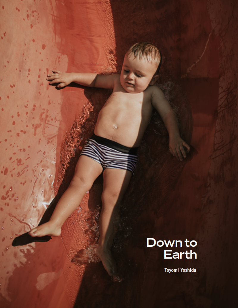
Water dripping from the faucet. The drooping face of a pug. The roots of a tree growing towards the center of the earth. Down to Earth is a lookbook where I visually explored the concept of gravity. The concept is expressed through photography, quotes, handmade typography, and imaginative collages.
RESULTS
the final book
PROCESS 01
research & planning
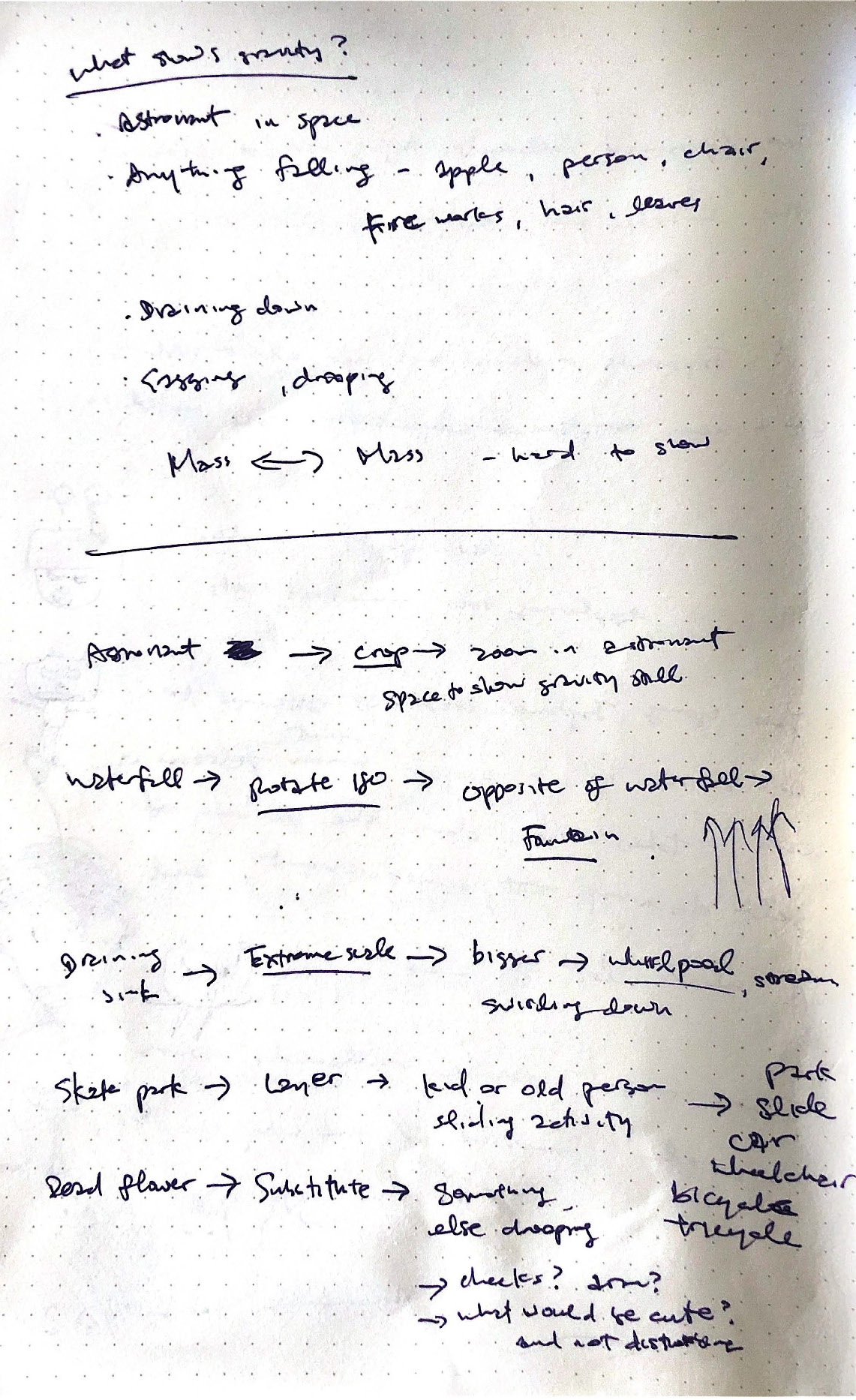
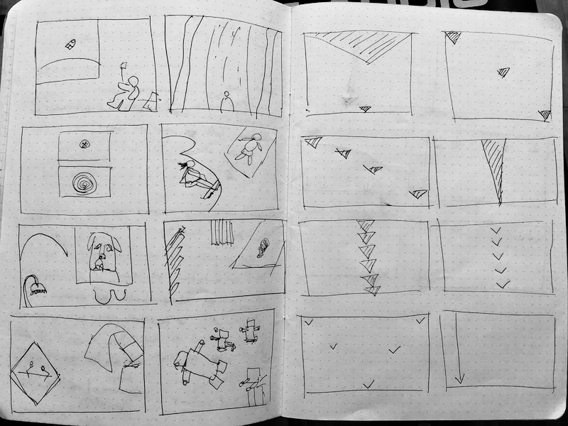
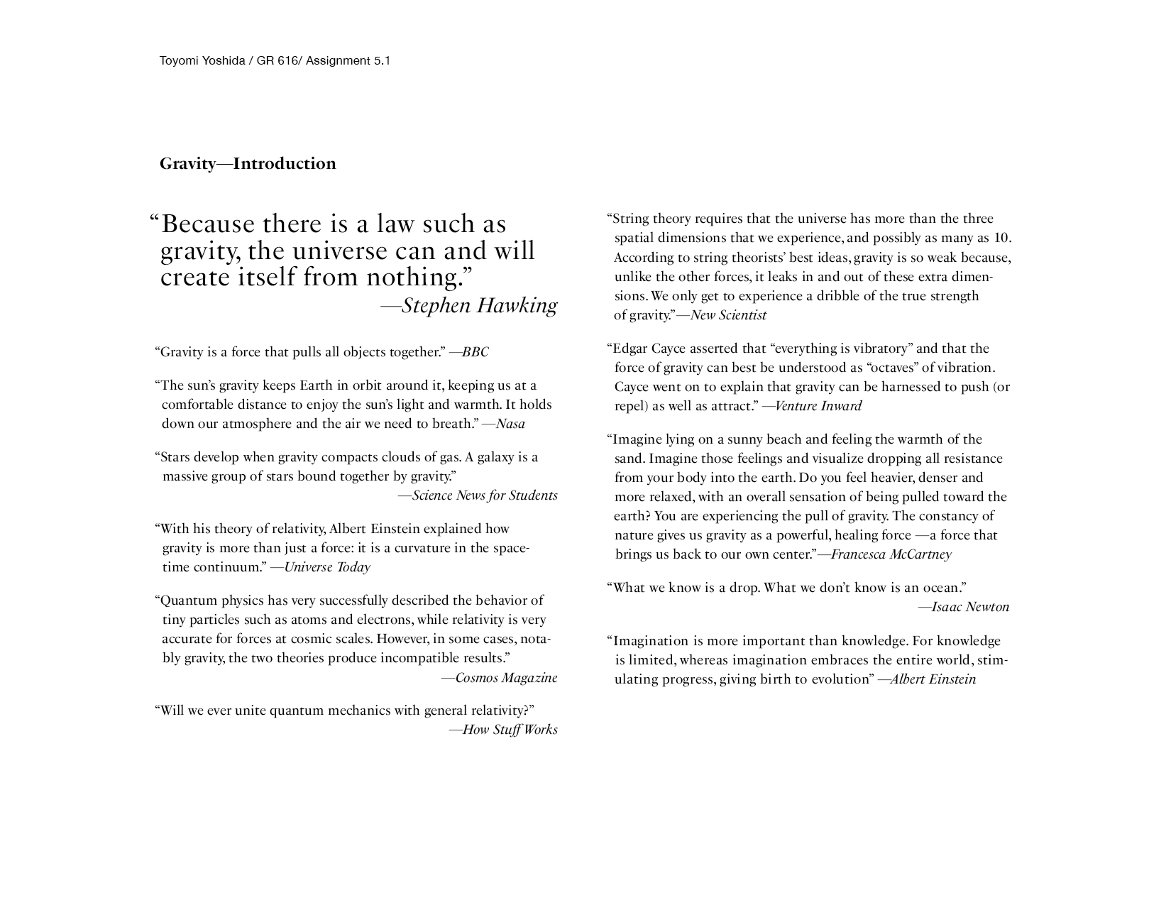
Gravity was the central concept of the book. I began by gathering quotes about gravity, which helped me start my brainstorming process of what types of images to include. I gathered images to explore concrete and abstract ways to explore gravity, and planned spreads throughout the process.
Process 02
creative thinking
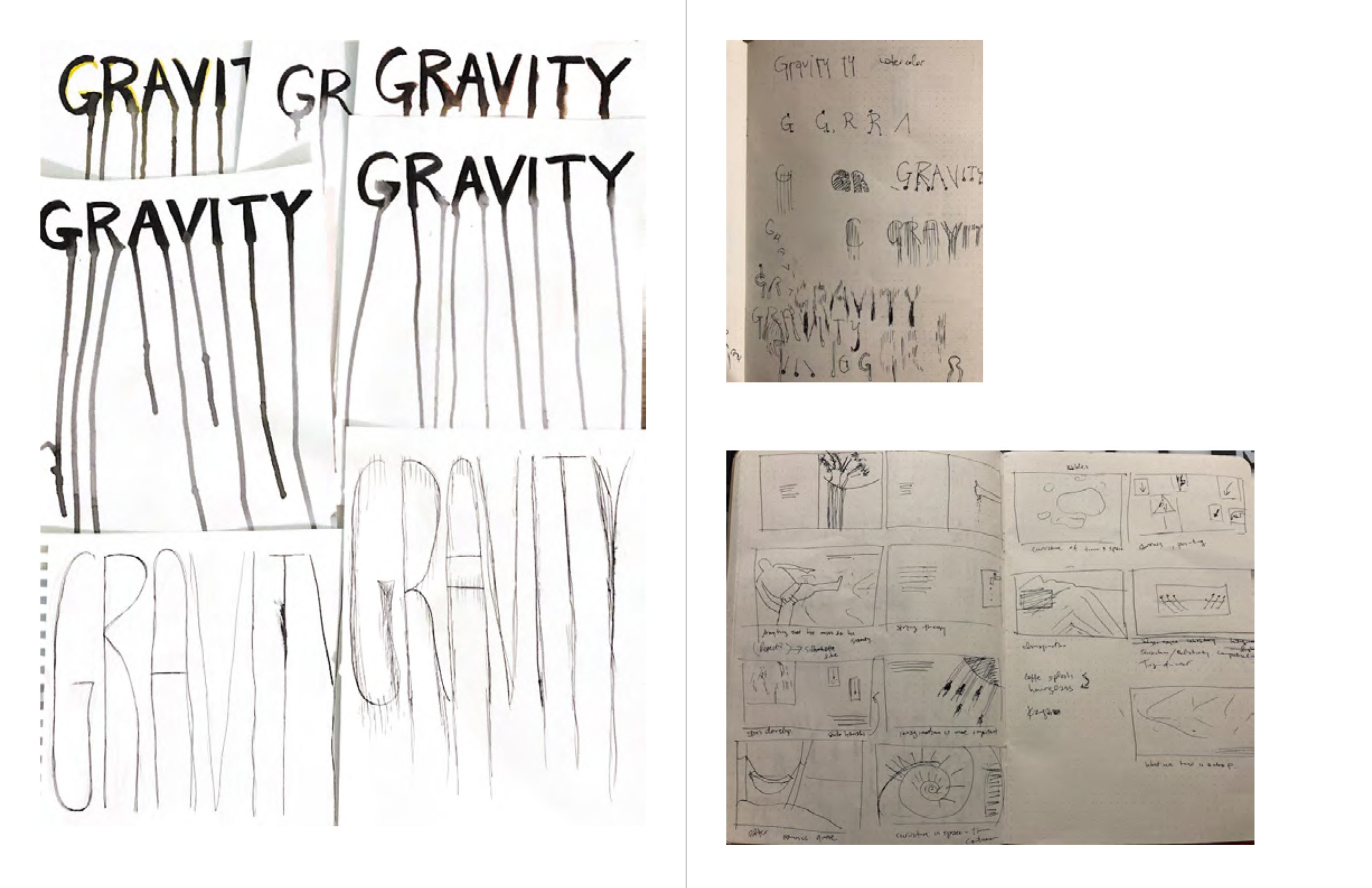
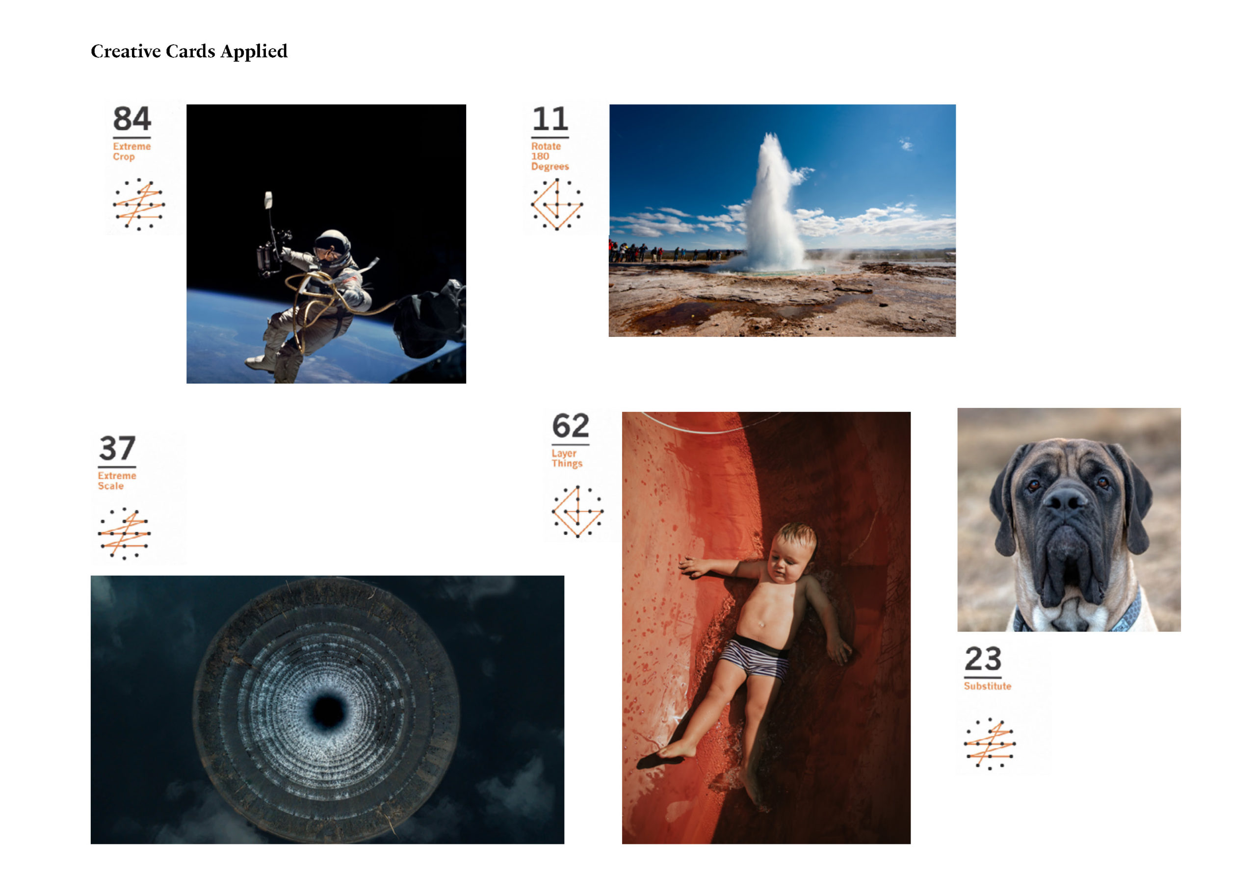
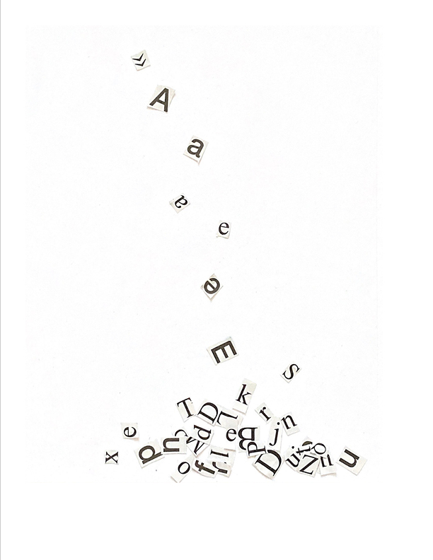
With photographic images, I applied creative cards to them to see if I could come up with a different perspective or subject matter. For example, the image of a sink became one of a reservoir when I applied the card “extreme scale.” There was much trial and error in the creative process. As you can see below, I had a hard time getting the ink to flow straight down for the handcrafted typography.
featured pages
digital collage
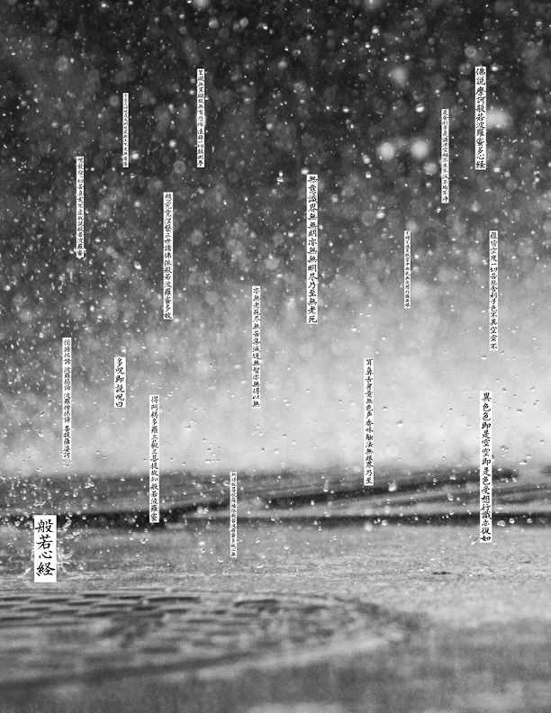
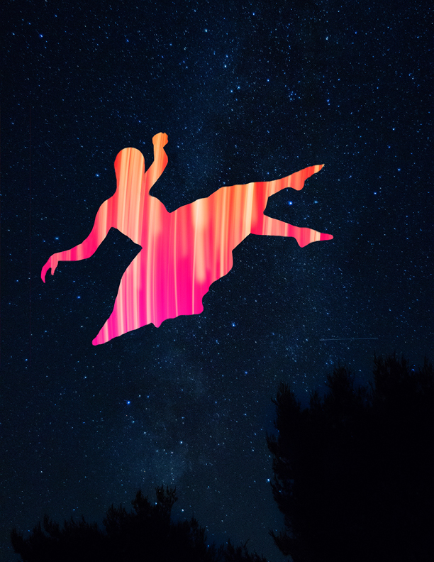
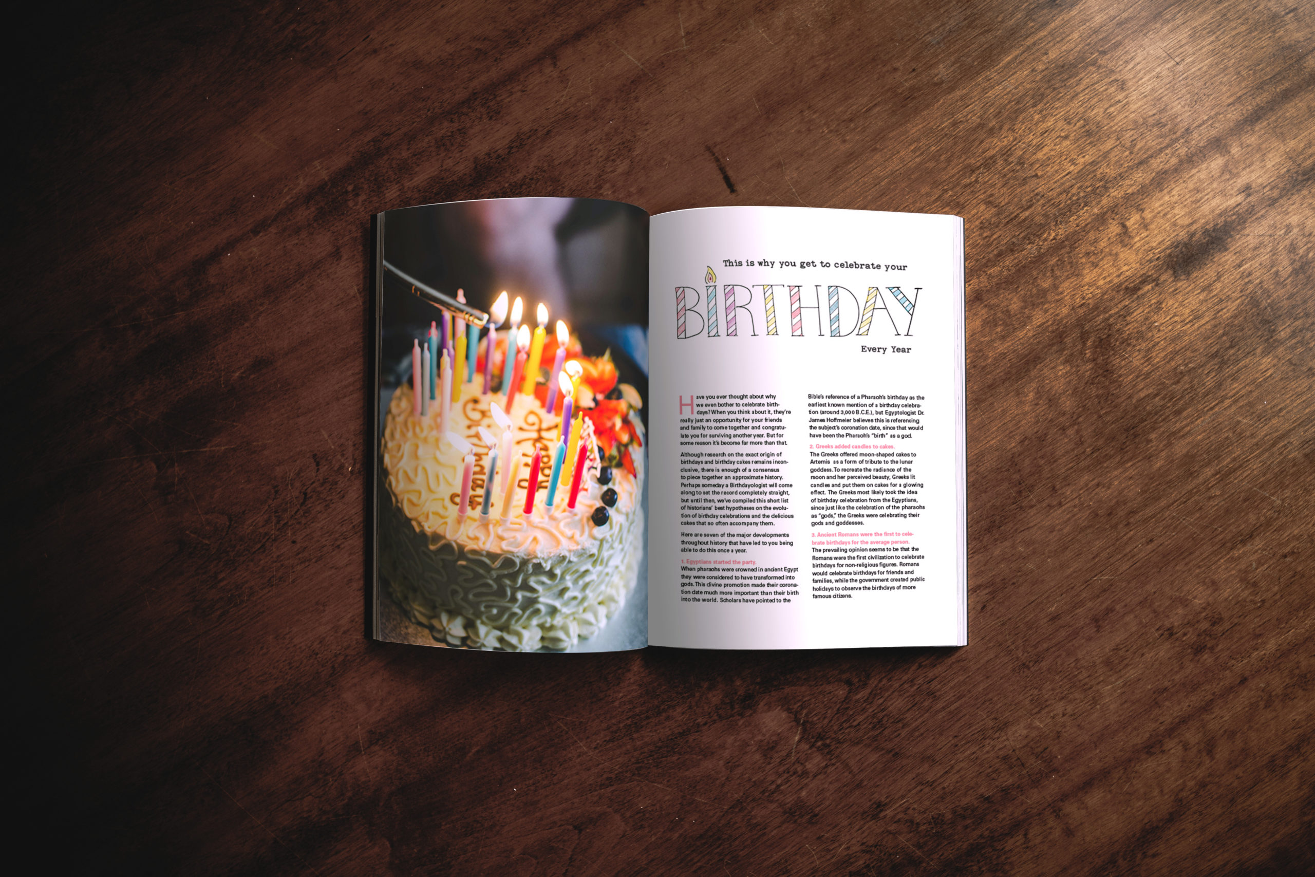
Making collages was one of the most inspiring parts of this project. Collages are interesting because of their layers. What’s the significance of the buddhist Heart Sutra raining down? Chanting it may have a grounding effect. The person falling in the night sky is layered with lines to reinforce the possible meaning of gravity.
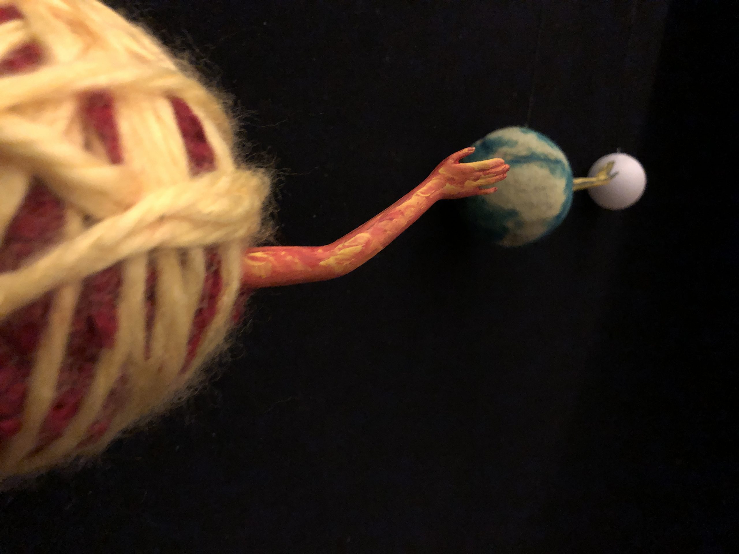
Not obvious enough
I wanted to show the gravitational relationship between the sun, earth and moon. The hands represent gravitational pull, but you don’t know that unless I explain it. Since the images in this book needed to be self-explanatory, it did not make the cut. It’s too bad because I cut off arms from a barbie doll to make this (Not recommended! I was creeped out for days after).
rejects
not everything makes the cut…
As they say, “murder your darlings.” Even if you like something in isolation, they could potentially create inconsistencies within the overall work. Here are a couple of examples with explanations of why they didn’t fit.
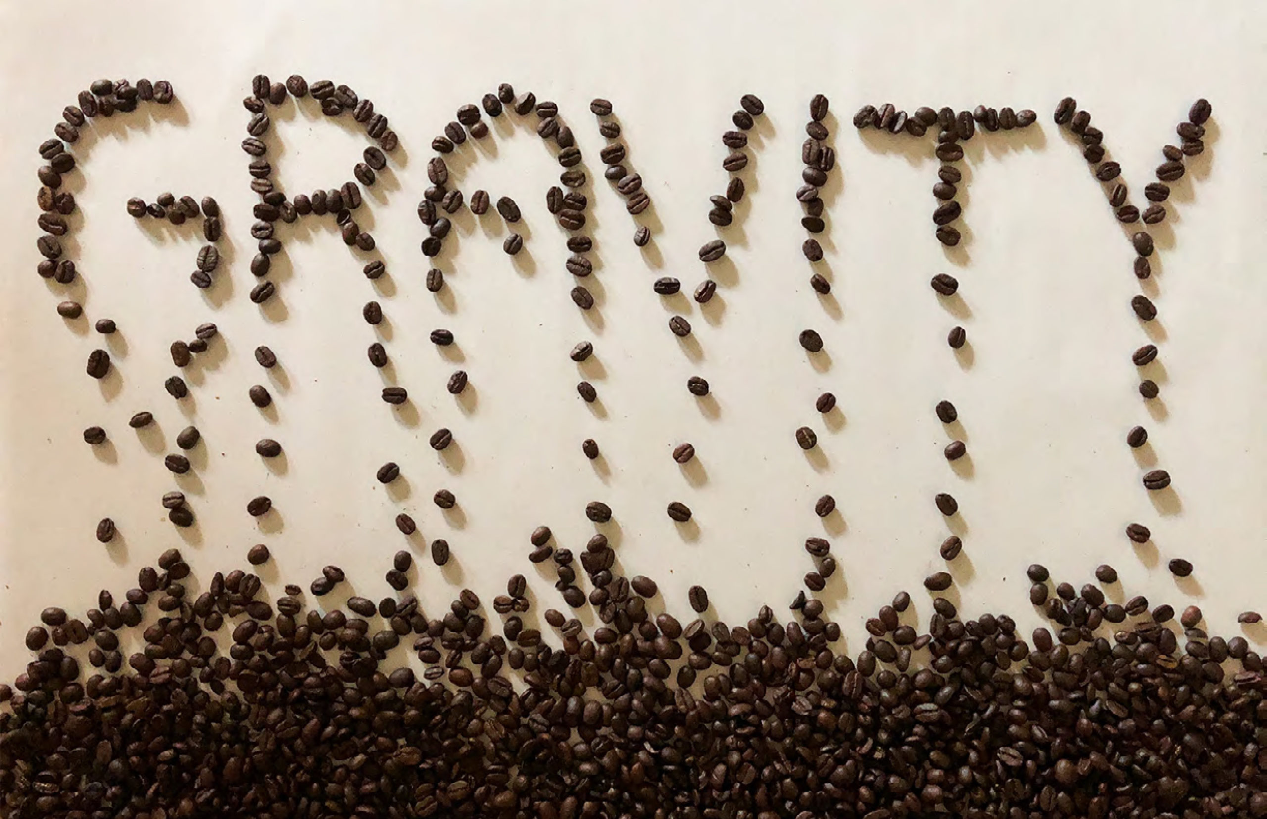
Not directly related
In this handcrafted typography, coffee beans falling down shows gravity. However, coffee beans themselves do not have a strong enough relationship to gravity.
Portfolio
Related Work
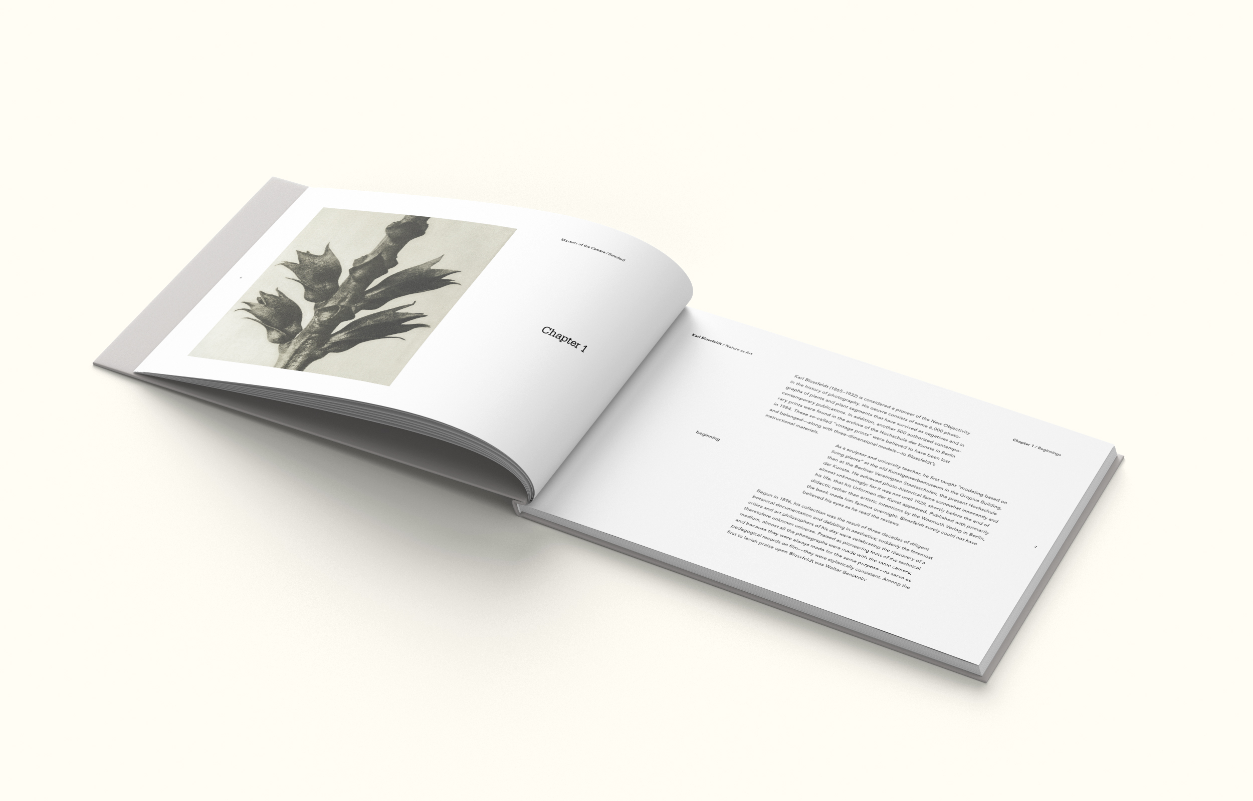
Nature as Art
Print Design
MAGAZINE LAYOUTS
Print Design
Get In Touch
let's work together!
toyomi@toyomi.space

