earbud
Earbud is a magazine that targets music lovers in their mid-twenties to mid-thirties. (personal portfolio piece)

Part 1—Result
the final logo
In the final version, the shape of the earbud is inside of the letter “b.” It’s minimalist with a slight bit of flair with the type modification.


Part 1—Process
the logo
For the logo design, I wanted to incorporate the actual shape of an earbud. I explored a few different serif and sans serif fonts and thought about how the earbud shape can be expressed.
Part 2
the news site
This print art needed to be digitalized for publication. Matice and I discussed how much of the analog feeling should be left in tact while cleaning up excess noise, and arrived at the final version below.


03.
iphone and ipad versions

Portfolio
Related Work
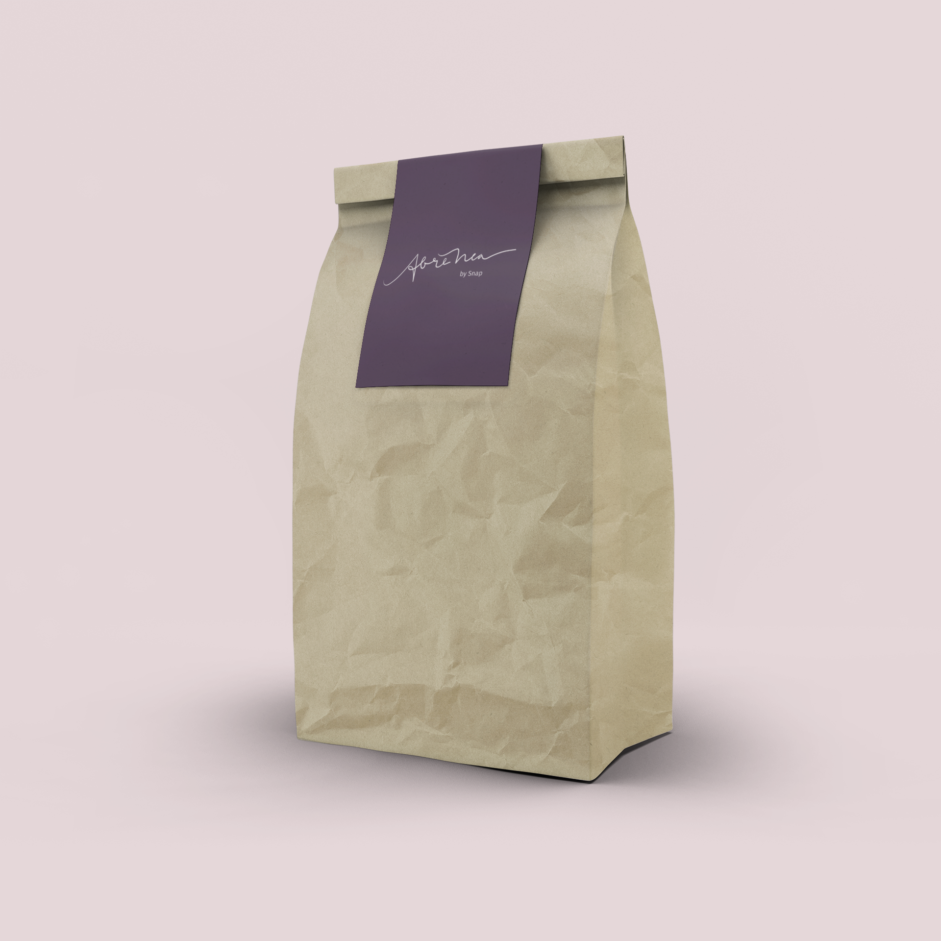
Abre nea
Logo & Branding, Social Media
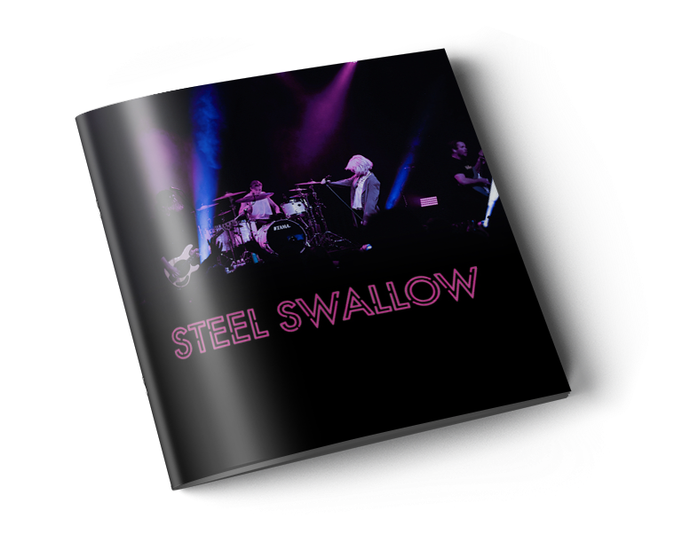
Steel Swallow
Logo & Branding, Print Design
Get In Touch
let's work together!
toyomi@toyomi.space